




Getting your logo ready for branded workwear
Most people think the branding starts at the machine. It starts with the file on your desktop — and by then, most of what decides how good it looks is already set. Here's how to send us the right thing, first time.
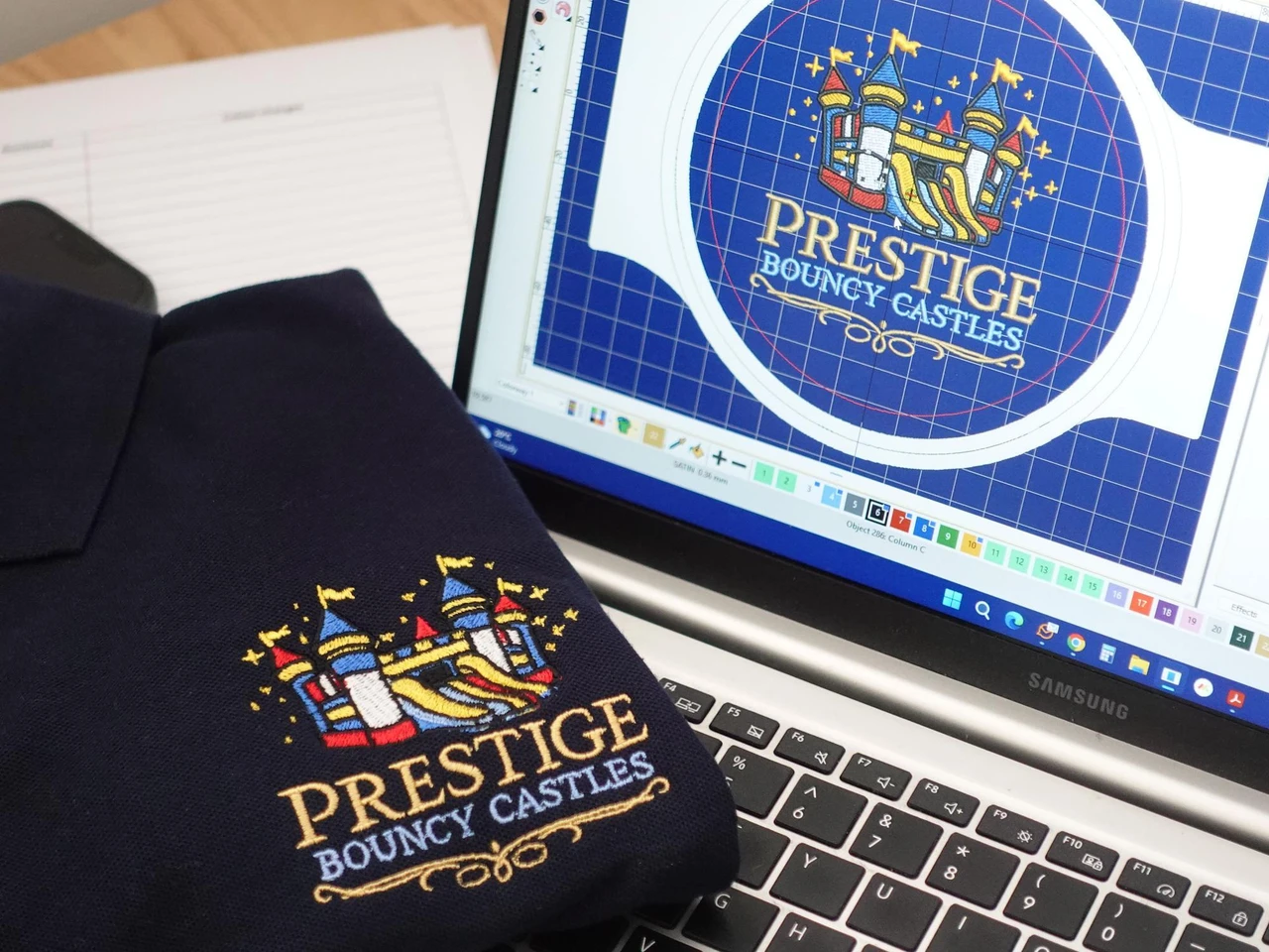
The decisions are made before anything is stitched
By the time your logo reaches an embroidery head or a print bed, most of the choices that determine how it looks have already been made. This is the part of the process that's quietly won or lost.
A logo that's genuinely ready produces work you'll be proud to hand out. A logo that isn't gets caught at proof stage, adds a couple of rounds of back-and-forth, and occasionally has to be rebuilt. None of that is a disaster — it's all fixable — but it's far easier if you know what "ready" looks like before you send it. And when a logo does need work, our designers would far rather pick up the phone and talk it through than trade a string of emails — it's quicker, and it gets to the right answer faster.
Suitable for three things at once
A logo doesn't have to be perfect to work — it has to be suitable. And a logo can pass one of these and fail another, which is why we check all three.
The method
Embroidery stitches your logo in thread and loves clean, bold shapes. DTF print (ink bonded under heat) holds full colour and fine detail thread can't. Each asks different things of your artwork.
The garment
The same logo behaves differently on a heavy jacket and a lightweight tee. Fabric and weight change what a decoration method can hold — so the garment is part of the question, not separate from it.
The size
A logo that reads across a back can lose fine detail shrunk to a left chest. What works large doesn't automatically work small — so we check it at the size it'll actually be worn.
The most common snag isn't a bad logo
It's a good logo saved in the wrong form. Two things come up again and again: a file that's simply too small — only a few kilobytes, with no real detail to reproduce — and a flat image where a scalable version is needed.
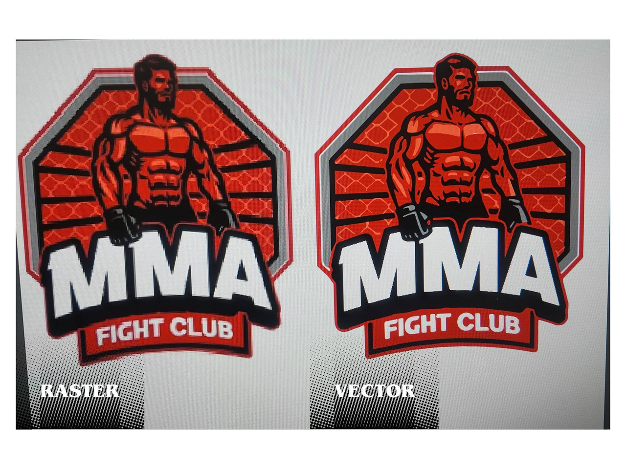
The terms matter. A raster file (PNG, JPEG) is made of pixels, so it blurs when enlarged or reworked. A vector file (built in software like Adobe Illustrator, saved as AI or EPS) is made of lines and shapes, so it scales to any size cleanly. For decoration, vector is what we want to work from.
If all you have is a flat image, we can redraw it into a clean, scalable version. Where a logo needs that redraw, or a supplied logo isn't suitable for the method you've chosen, there may be a small one-off setup or re-draw charge — and if so, we'll always show it clearly on your quote before anything goes ahead. Nine times out of ten a customer sent the flat version simply because it's the only one on file, so it's always worth asking your designer whether a vector exists first.
A word on AI-generated logos
AI logo tools produce genuinely impressive images — and for a website, an email footer or the side of a van, they're often absolutely fine. The problem is specific: heavy detail doesn't survive being embroidered. A cartoon character, a person, a background scene, a building — the rich detail these tools are good at — can't be rendered in thread. A needle simply can't reproduce what a screen can.
One customer once sent a beautifully detailed illustration of themselves on a road, with a house, a van, a lawn and fencing all in shot. Lovely image — but the logo we actually needed to embroider was the plain company name on the side of that van, not the whole scene.
The logo is there to catch the eye, not do a presentation.— Penguin Uniform production team
Not every AI logo is a problem — it's the heavily illustrative ones that struggle. And there's a simple way to work with the tool rather than against it. First, let it generate exactly the logo you're after — don't hold back on the vision. Then, in the same chat, ask it a second question: "If I were going to simplify this version for embroidery, to go on work clothing, how would you do it?" You'll usually get a cleaner, decoration-ready version back — and you'll learn what makes a logo work in thread while you're at it. That one follow-up saves more back-and-forth than anything else on this page.
Tell us what matters
Two predictable surprises live here, and both are easy to head off. First: a logo the same colour as the garment — a black logo on a black polo — disappears. When we spot that, we flip the colour for you so it shows. It's usually the first sign a customer gets that we've made an adjustment, and exactly what our proof stage is for.
Second: print colour and embroidery colour never match each other exactly. They're different materials — ink versus thread. We do our best to match our DTF ink to the nearest thread colours (and the other way round), and we get impressively close — but it'll never be a 100% match, because the two materials catch the light differently. If an exact brand colour matters, tell us and give us a reference to work to. We'd always rather work to a reference than guess — because on colour, we don't guess.
What reads big doesn't always read small
Fine text is the usual casualty. Embroidery has a genuine physical limit — a needle running at around 850 stitches a minute through fabric, plus the natural pull the stitching puts on the material — so very small or thin text can lose a little crispness. Print holds detail better, but even DTF can't shrink indefinitely: the ink is held by adhesive, and below a certain size there isn't enough to grip the finest lines.
The thing that trips people up most is a strapline — the small line under a main logo. Fine at large scale, it often needs widening to the logo's width, or splitting over two lines, to stay legible on a left chest. Some customers, once they see the proof, simply drop it for the small placement.
This is also where our team earns its keep. Rather than just reproducing what you send, our designers will often suggest a change that measurably improves how the finished logo comes out — nudging a size, widening a strapline, simplifying a fiddly detail, or adjusting placement so it sits right on the garment. It's a proof-stage conversation, not a problem.
Can you see it from a reasonable distance?— The test we apply to every small logo
You don't need to be a design expert
The best briefs just get a few things right:
- Clear on what and where — which logo, on which garment, in which position.
- The correct files — a vector (AI or EPS) for print work wherever possible.
- Known changes flagged up front — "our logo is black, the garments are black, please change it to white," or "we don't need the strapline on the small version."
- Anything extra, said at the start — a website or social handle to add, rather than after the proof.
And if you're not sure what you've got? Send it anyway and tell us how it'll be used. Working out whether a file is usable, and what it needs, is our job — not yours.
The proof stage catches the small stuff
Before anything is made, you see exactly how your logo will appear — colours, spelling, size and placement — and you sign it off. Treat that as a proper approval, not a formality. When a logo won't work as supplied, we tell you before we start, not after — and we do it with everything we've built in-house behind the check.
Every figure is a real, in-house number — no outsourcing, no middleman.
Getting started
Send us your logo, tell us what garment it's going on, and how it'll be worn. We'll tell you honestly whether it's ready, what — if anything — it needs, and what it'll look like on the finished item.
If it needs a little work to perform at its best, we'll say so up front, show you the options, and only go ahead once you're happy.
And you don't have to do any of this by email. The people preparing your artwork are real humans you can actually talk to — so if you'd rather think it through out loud, pick up the phone. It's often the fastest way from "I'm not sure this will work" to "that's exactly what I wanted," and it's the part of the job our team enjoys most.
Keep deciding with confidence
Embroidery or Print?
How to choose the right finish for your workwear.
The Penguin Academy
Advice-first guides to help you decide before you order.
Workwear Bundles
Kit built around the job, not the price tag.
Meet the Team
The people who frame, print, trim and check your order.
Customer Reviews
What businesses say after the kit's been worn and washed.
Contact Our Team
Send your logo and we'll talk it through.